How to ACTUALLY create KILLER Thumbnails
Saturday, August 17, 2024
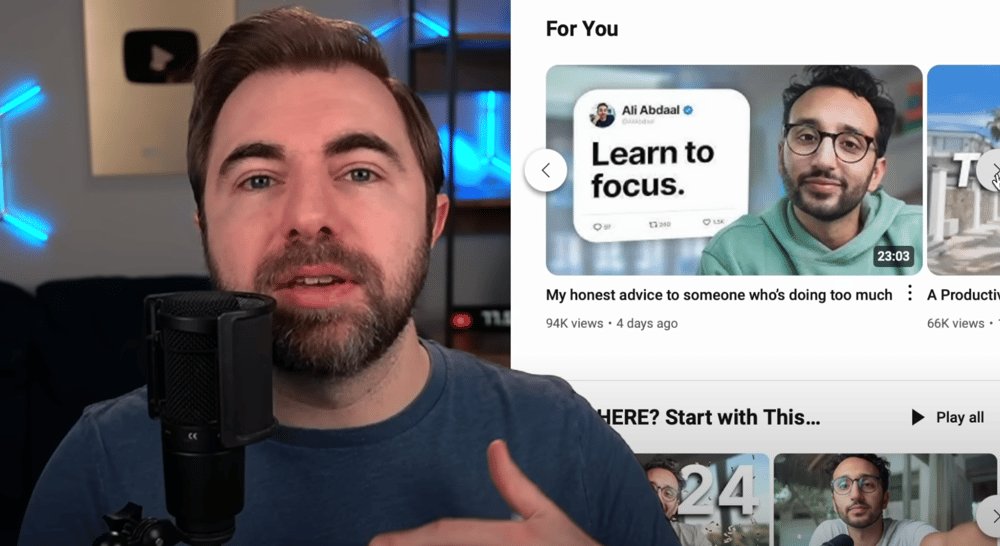
This Week's YouTube Strategy Recap:
Creating KILLER Thumbnails
Strategy Recap is where we summarize new information from one of the top industry leaders in YouTube strategy, so you can learn faster and explode your channel!
vidIQ released a new video on How to ACTUALLY Create KILLER Thumbnails, which goes over practical steps and strategies for helping channels of any size get more clicks on their videos from subscribers, and more importantly, first time viewers.
Here’s the summary:
Starting off, he admits that the videos vidIQ has previously made about thumbnail strategies have been pretty surface level. So, he wants to change that with this video by taking a deep dive with us.
He states that…
A good thumbnail is the difference between 100 views and 100,000 views.
Design element #1: LAYOUT
He brings up Ali Abdaal as an example of a creator that has mastered the art of making a “nice, clear, simple” thumbnails:

He compares the above thumbnails to one of Abdaal’s early thumbnails:

He explains that this thumbnail doesn’t work well because your eye doesn’t really know where to look. He states that this thumbnail gives “visual overload, and it’s just going to end up looking like noise when it hits the YouTube homepage.”
- He explains that the technique Abdaal uses now is an old trick known as…
The Rule of Thirds
He explains that to implement The Rule of Thirds, all you need to do is place a 3x3 grid over your image:
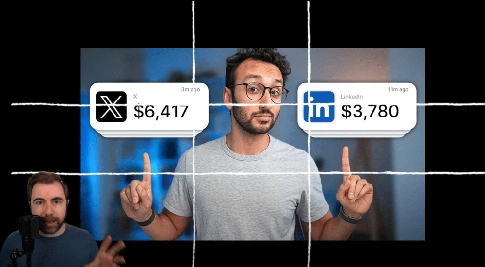
He explains that all the key elements in the thumbnail should align with the grid lines:
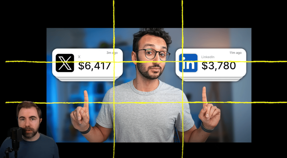
And/or should align with the intersections of those lines:
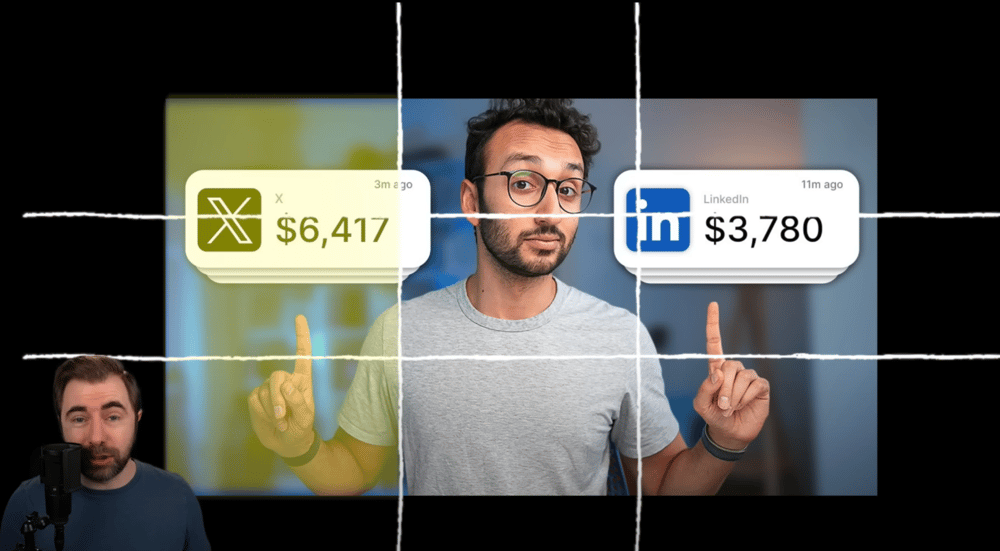
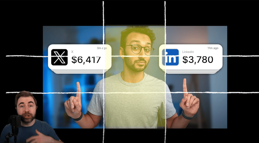
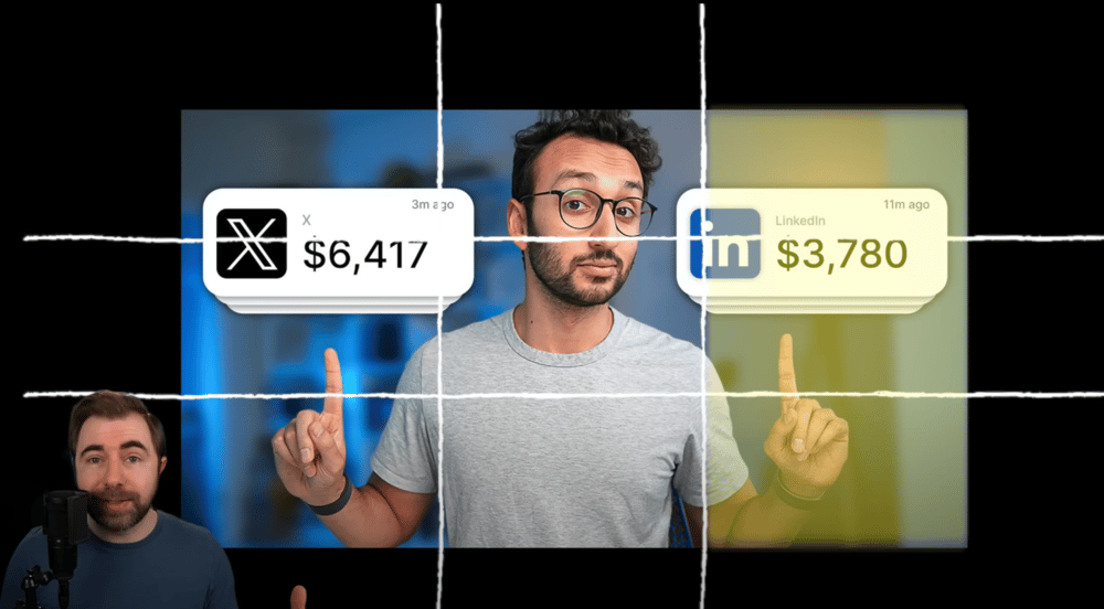
He explains that in addition to The Rule of Thirds, Abdaal is also ensuring that there is no more than 3 main elements in the thumbnail:
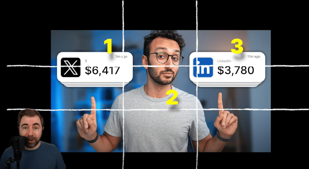
In this example, the 3 main elements are the X income graphic, Abdaal himself, and the LinkedIn income graphic.
Why 3? He says that “our brains love an easy-to-digest pattern and 3 is a nice easy number when it comes to the size of a YouTube thumbnail, and getting a clear message across.”
Wasted space.
He brings up a Twitter (now called “X”) thread between MrBeast and Colin and Samir. The thread starts with Colin and Samir tagging MrBeast in a tweet asking which thumbnail they should use (on a video about MrBeast):
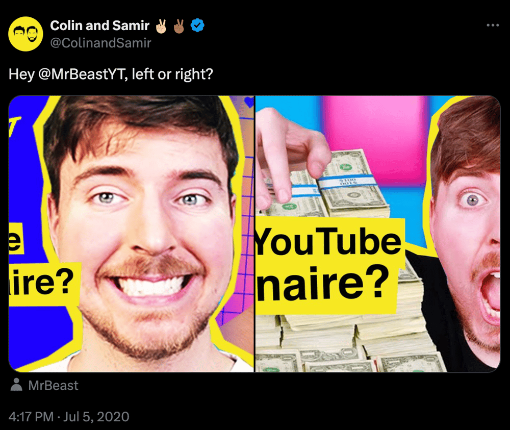
He summarizes the thread by explaining that MrBeast recommended Colin and Samir to move his face all the way over to the edge of the thumbnail in order to create more space for the text and other elements. This helps to keep the thumbnail from getting crowded so that it can “really grab people’s attention.”
Like this:
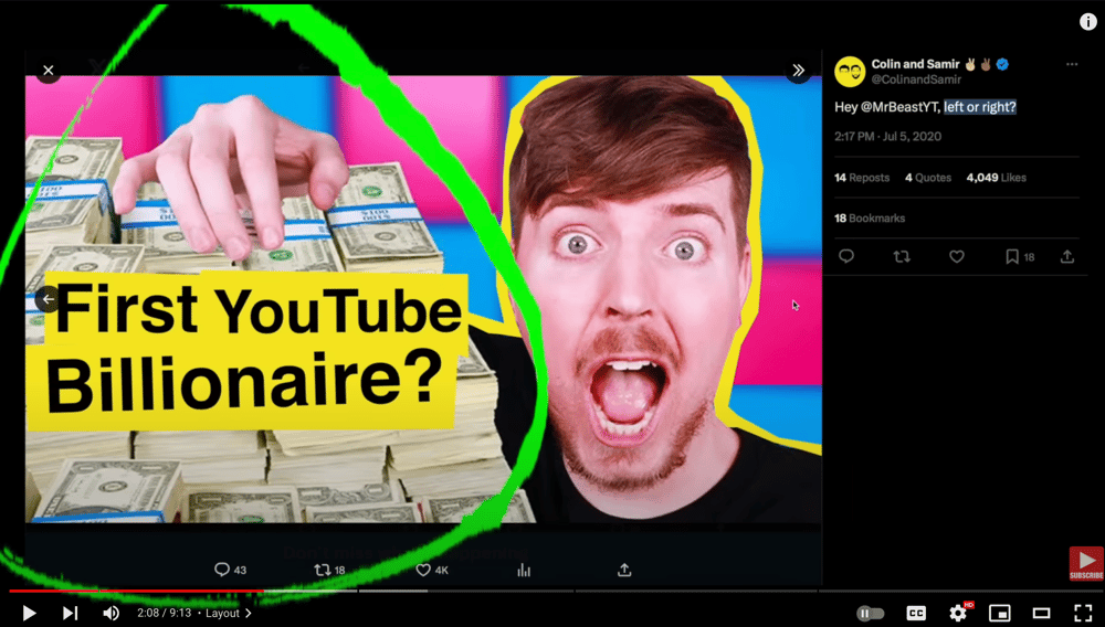
He warns creators to avoid using this extra space to add “a whole bunch of visual chaos.” Remember, we only want to have a few elements in the thumbnail to keep it clear and eye-grabbing. Keep it simple.
He brings up another example that showcases another X thread, but this time it’s between MrBeast and Yes Theory.
Here’s what Yes Theory asked:
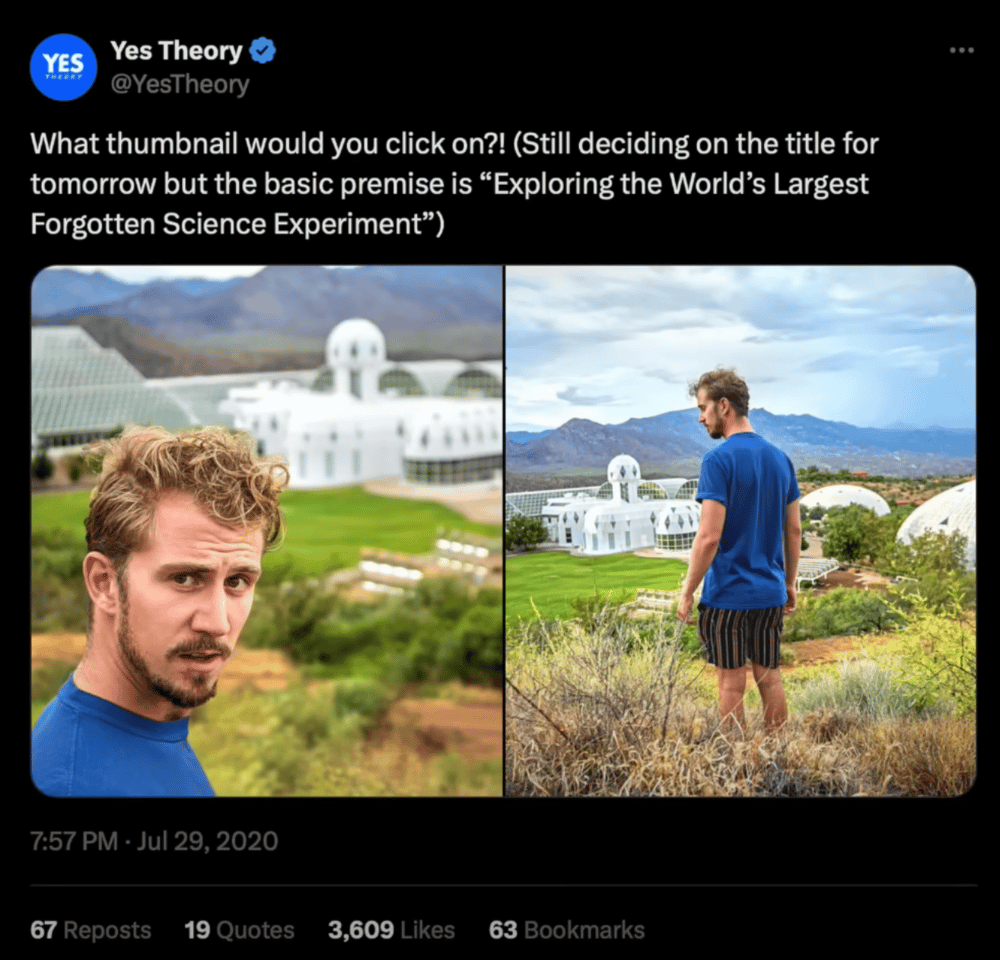
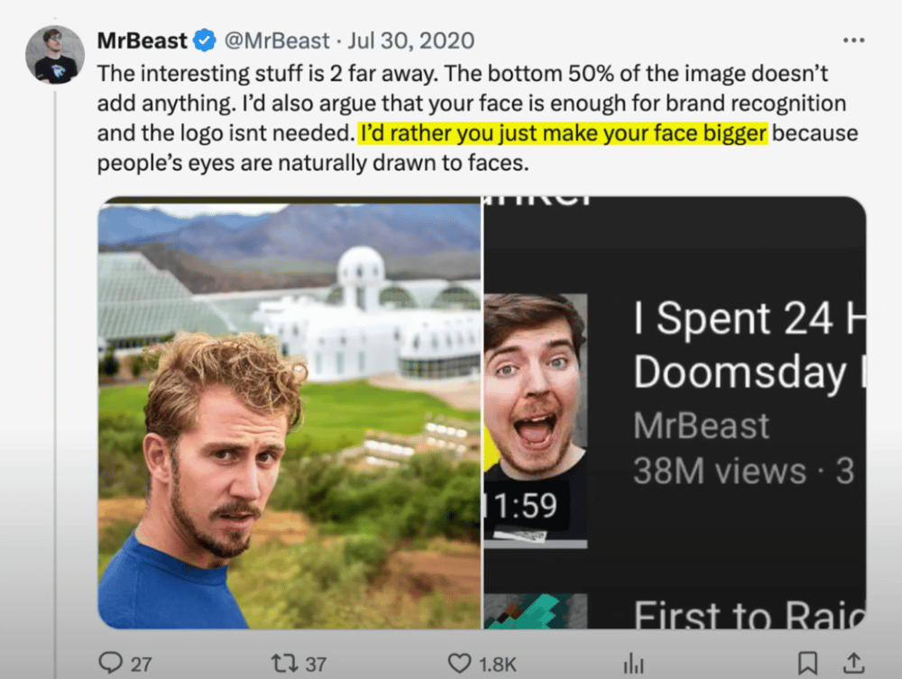
The vidIQ expert points out that MrBeast is emphasizing the importance of making the main subject stand out in the thumbnail.
He then ends this section by reminding us that YouTube is a very competitive landscape. Thus, the better layout you have for your thumbnail, the more you video will stand out amongst the crowd.
Design element #2: COLOR
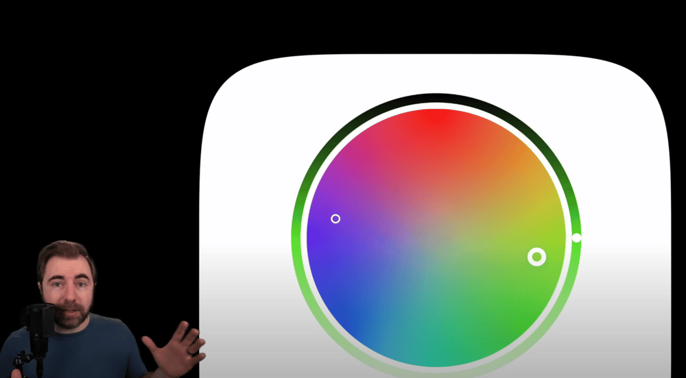
He points out that colors on opposite ends of the color wheel will contrast the best with one another (like the pictured purple and green).
He points out how successful YouTubers (like MrBeast and vidIQ themselves), use color theory to evoke an emotional response from the person seeing your thumbnail.
He uses the vidIQ channel as an example and states that each color they use serves a different purpose:
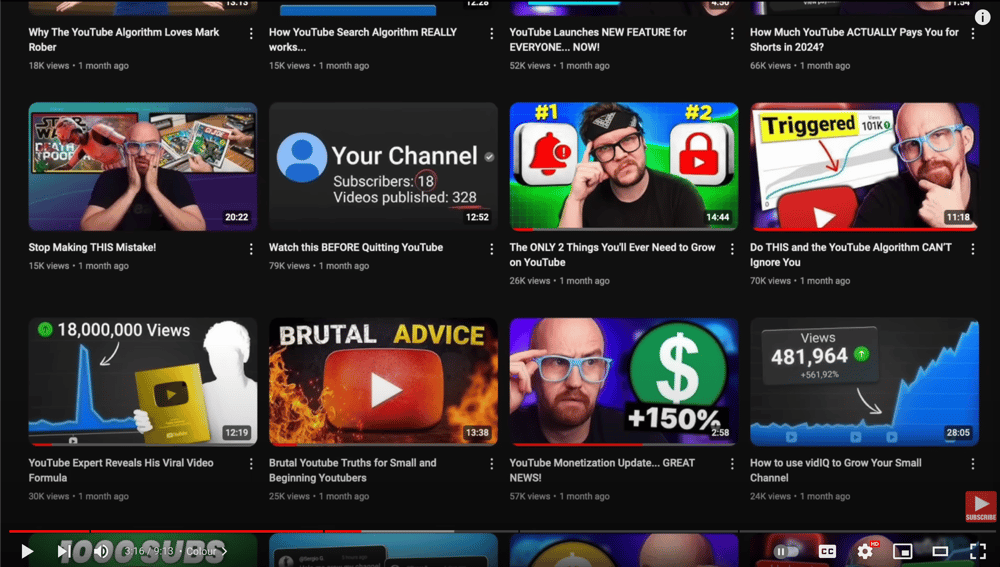
He explains that they use red when talking about mistakes (to elicit a sense of urgency), green to invoke positive emotions that would come with a positive change (like an increase in revenue or views), and then purples and blues to invoke a feeling of trust.
He brings up Ali Abdaal again and explains that Abdaal’s thumbnails are “bathed in light.”
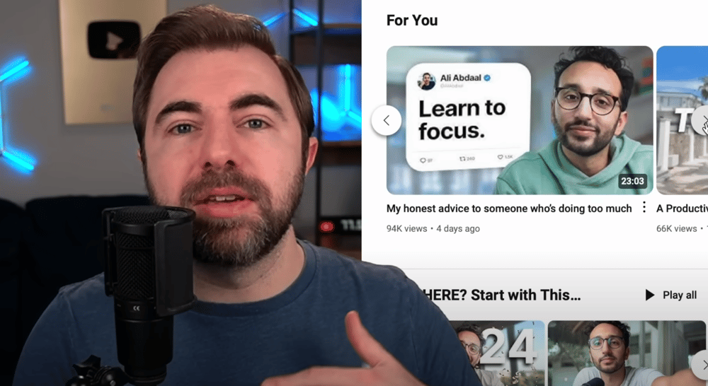
He points out how Abdaal uses a lot of common colors (we think the expert means neutrals when he says “common colors”) because Abdaal’s channel is about productivity and personal growth. These colors bring a sense of calm, which is what you want when you’re pursuing productivity and personal growth.
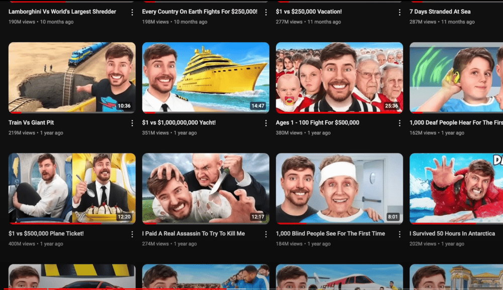
He compares this to how MrBeast uses bright, loud, and clashing colors to invoke a feeling of excitement:
He then brings up a color hack that he learned from The Spiffing Brit:
In summary, he explains that it’s beneficial to utilize colors that other creators in your niche aren’t utilizing as much. This will help your videos to stand out from the crowd.
Design element #3: TEXT
He starts off by making it clear that not all thumbnails need text. If fact, the way that you use text in your thumbnail can make or break your video’s performance.
He brings up “the three C’s.”
The first “C”: Curiosity
He states that text can be the ultimate teaser to a video. Like this thumbnail from Ali Abdaal:

He points out that since Ali Abdaal is known for his personal and financial success, the “i failed” text provokes curiosity from the viewer.
💡 BetterFlow would like to add to this point by letting you know that teasing negative outcomes tends to garner more curiosity from viewers. Thus, causing them to click.
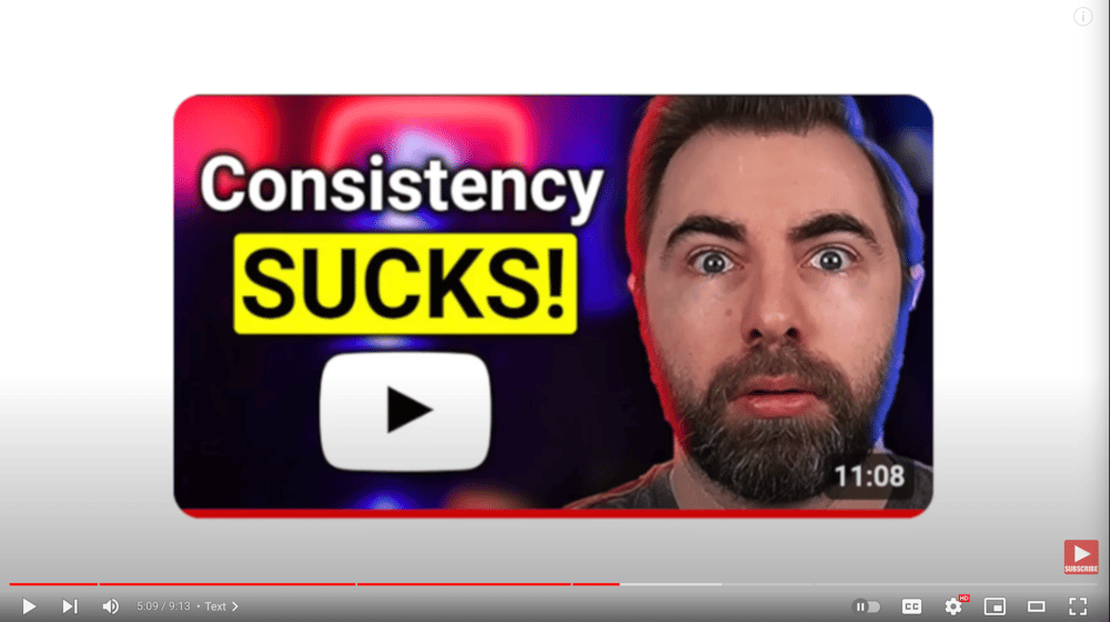
Another option he goes over is that your thumbnail text could push against a common narrative that people believe in order make the viewer curious. Like this thumbnail from vidIQ:
Another option is that your text could tell people something they really don’t want to hear. Like this thumbnail about MrBeast:
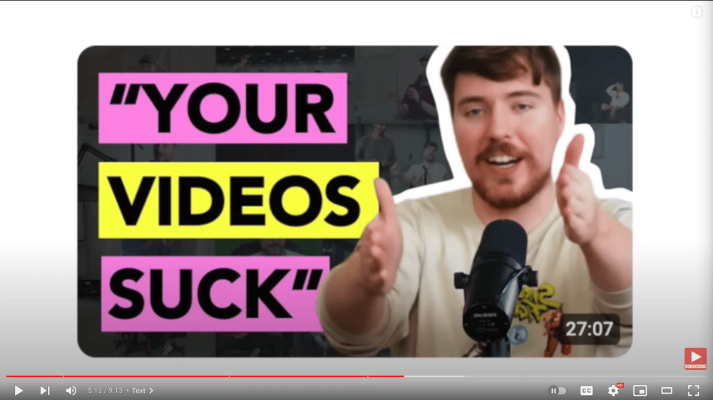
The next “C”: Clarity
The vidIQ expert immediately makes it clear that, even though a video may cover a lot of things, do not use thumbnail text to try to explain the entire video.
Instead, just tease the most interesting thing, the most important thing, and/or the overarching theme of the video as the focus of the thumbnail.
He recommends trying to use no more than 3 words when you’re using text.
The final “C”: Compliment
He starts off by stating that your text should work with the thumbnail and not against it. He expands by recommending that you avoid putting text in places where it’s going to obscure part of the image.
He gives some more examples on what to do, but they’re similar to the ones above already featured above. He doesn’t give examples on this point for what *not* to do.
Use YouTube’s new “Test & compare” thumbnail tool.
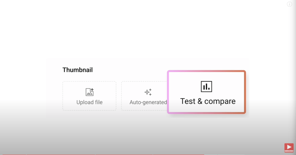
It allows you to put up to 3 different thumbnails on your video. With this, YouTube will show the different thumbnails to different people and give you data on which thumbnail gets the most clicks from viewers. Once YouTube has enough data on the different thumbnails, then it will apply the “winning” thumbnail as your main thumbnail to show to potential viewers.
He points out that you don’t have to add significantly different thumbnails to the video for the testing feature to work well.
He gives the examples of doing one thumbnail with text *vs* one without text *vs* one with different text.
Design element #4: FACE
He starts this segment by showing us these 4 screenshots and asks us to think about what stands out the most to us:
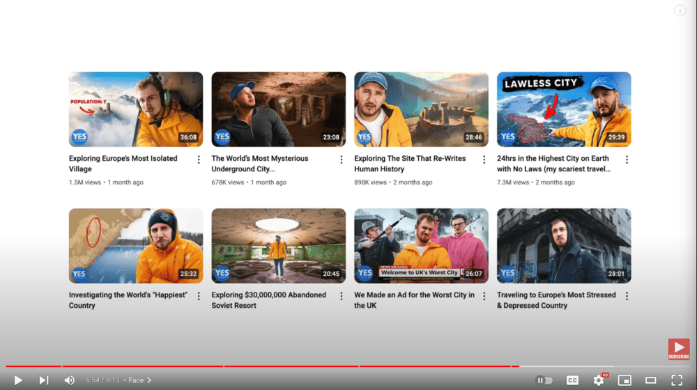
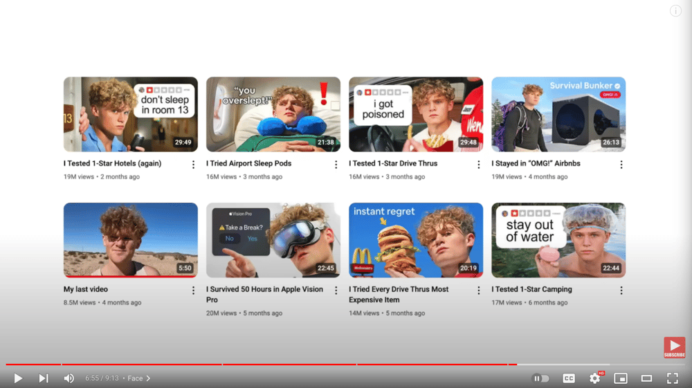
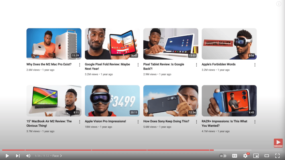
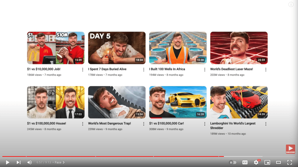
He then states that faces in a thumbnail are really interesting. He resists saying that they’re always required or not required. However, he has found through much testing, that thumbnails with faces in them almost always win over thumbnails without faces.
He supports this claim with actual data from the vidIQ channel:
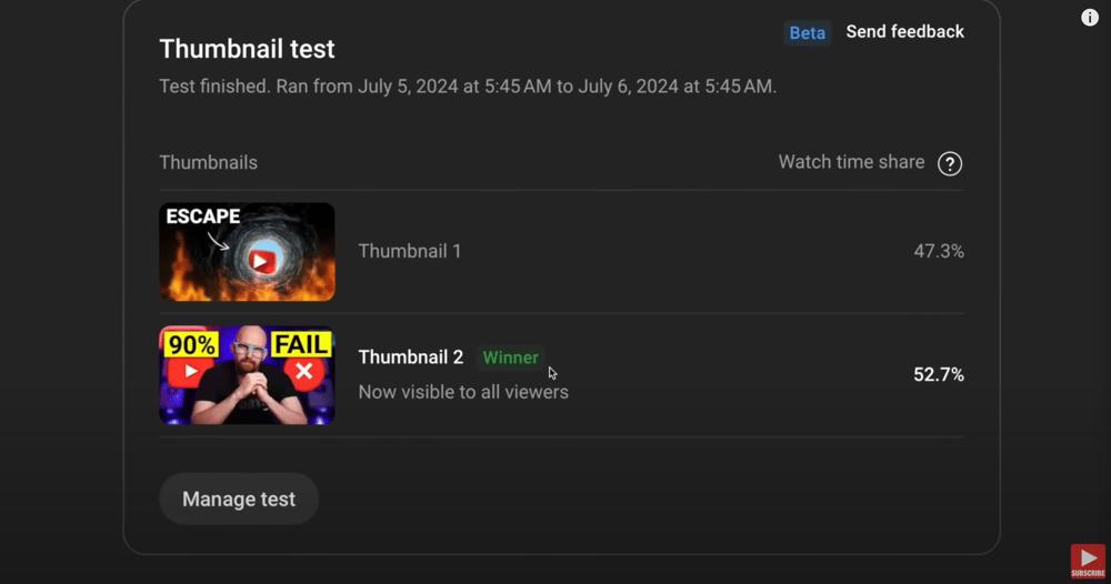
He notes that faces can be a way to immediately begin to build trust with a viewer, especially a new viewer.
Using Faces Effectively in Your Thumbnail:
Go big or go home with emotion (your expressions).
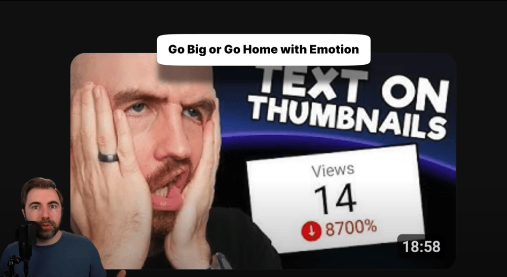
Make eye contact
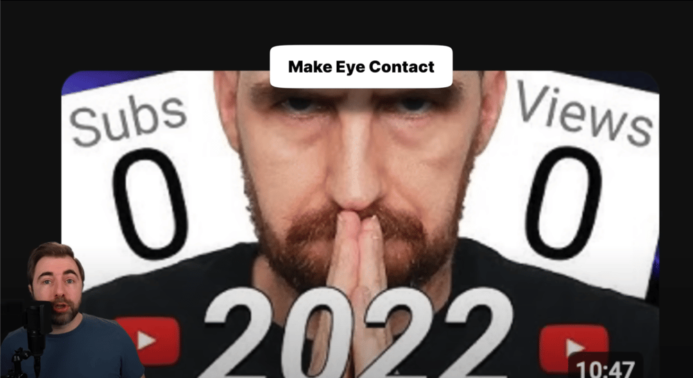
If you look straight into the lens, you look straight into the eyes of the viewer.
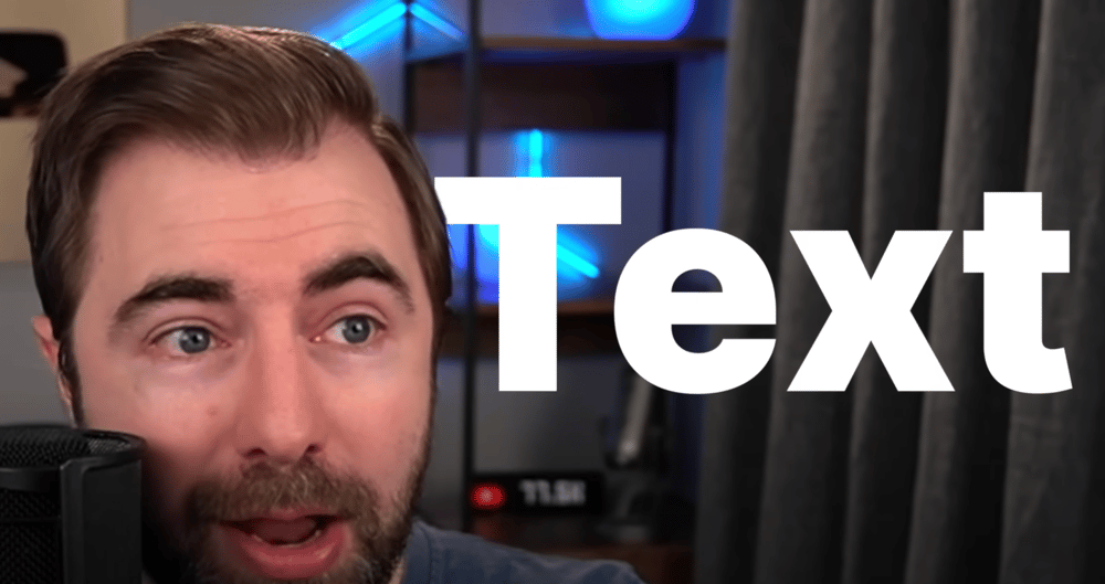
Alternatively, have your eyes looking towards an important element in the thumbnail (like text). He exemplifies this on the spot:
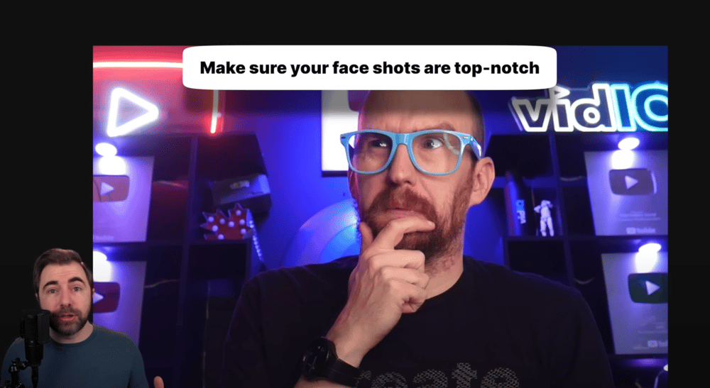
Make sure your face shots are high quality and very clear.
He warns against just grabbing a still from your video and making that part of your thumbnail because the quality is usually sub par.
Use recognizable faces.
He points out how a smaller creator, Aprilynne Alter, used MrBeast in her thumbnail when talking about MrBeast and it garnered her over 100x more views than her videos typically get. It was this previously featured thumbnail that got her that much attention:
BetterFlow note: Even though this is isn’t always possible, consider looking for ways to use recognizable figures in your topics, and thus, in your thumbnails. This can have massive positive impact on your reach since people already know, like, and trust public figures.
We can’t wait to see how these tips and strategies help you improve your thumbnail game, and get you closer to the results you want on YouTube!
Looking for a practical way to implement these strategies?
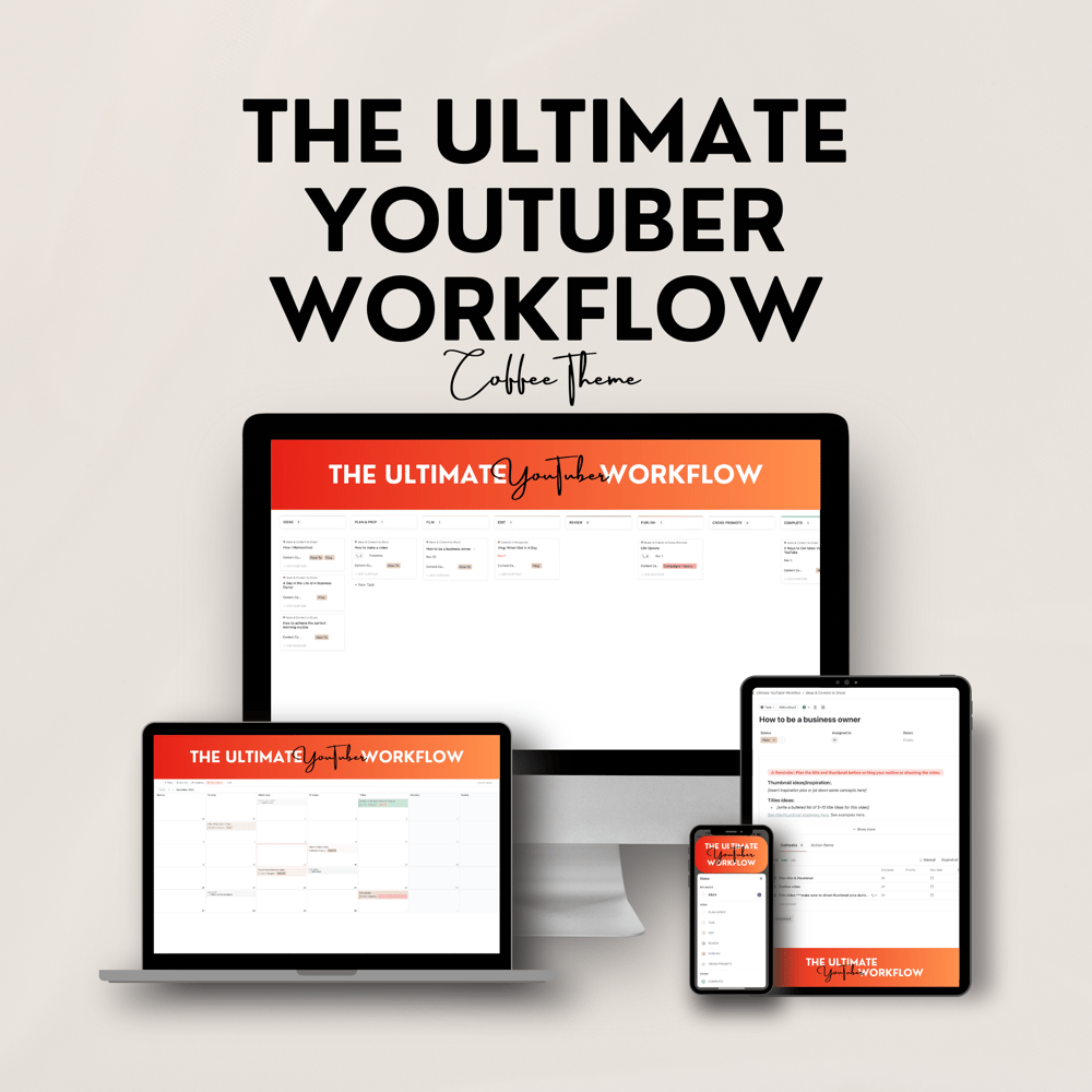
We’ve got you covered! Well… almost. We’re launching the Ultimate YouTuber Workflow very soon which takes all of the best YouTube Strategies and puts them into a daily workflow for you. This way, you don’t even have to remember the strategies. The workflow does it for you!
Follow the flow and watch your channel grow with The Ultimate YouTuber Workflow!

Hi, I Am D'Laina Hunt
Founder & CEO of Better Flow
Being a content creator isn't for the faint of heart, and we know that. That's why we're here to empower and enrich you with all the resources and knowledge we can get out hands on. Thank you for visiting our blog. We are rooting for you in your journey!

Coming Soon
The Ultimate YouTube Workflow is a powerful tool that will change your approach to content creation, for the better.
It teaches you best practices and helps you incorporate the best-known strategies for growth on YouTube, right into your content. Creating content that actually gets views has never been easier.
Super excited about this product? We are, too!
Get notified when it launches: